Android Keyboard Part 3: TextInputLayout
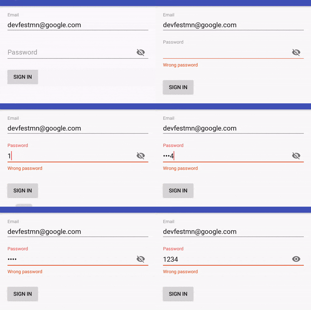
By now you’ve probably noticed the fancy moving hints above the text views in the last two posts. How does that work? The answer is incredibly simple: the TextInputLayout. Added as part of the Design Support Library, TextInputLayout wraps a text field and gives you a lot of nice design options that are very easy to set up. Here’s an example of what they can do.

There are a couple things going on here:
- The password hint moves out of the way
- The wrong password error message is much prettier than what you get with
editText.setError() - The toggle changes to password visibility
All of these are built in feature of TextInputLayout! Let’s see how they work
Setting up a TextInputLayout
Before you start, TextInputLayouts are part of this design support library, so add
implementation 'com.android.support:design:27.0.2'to your build.gradle.
In order to use a TextInputLayout, simply wrap one around a TextInputEditText.
TextInputEditText is a special type of EditText that’s designed to work well inside a TextInputLayout, and that’s why so much of this works.
Here’s the xml I used to create the password field above.
<android.support.design.widget.TextInputLayout
    android:id="@+id/passwordWrapper"
    android:layout_width="match_parent"
    android:layout_height="wrap_content"
    app:passwordToggleEnabled="true"
    >

    <android.support.design.widget.TextInputEditText
        android:id="@+id/password"
        android:layout_width="match_parent"
        android:layout_height="wrap_content"
        android:hint="Password"
        android:imeOptions="actionDone"
        android:inputType="textPassword"
        />
</android.support.design.widget.TextInputLayout>
Because I’m using a TextInputEditText, the hint will automatically animate, no extra work required.
Take a look at theapp:passwordToggleEnabled="true" line inside the TextInputLayout.
That’s all you need to get a password toggle!
Showing errors
Errors are displayed using TextInputLayout#setError(String). Note that this is called on the parent layout, not the text field. Here it is in Kotlin:
private fun signIn() {
    if(password.text.toString() == "1234" ) {
        passwordWrapper.error = null
        Toast.makeText(context, "Success!", Toast.LENGTH_LONG).show()
    } else {
        passwordWrapper.error = "Wrong password"
    }
}
Set the error text to display an error, or set it to null to hide it. That’s all!
Summary
TextInputLayouts are a great way to give your app a modern, professional feel, and they’re incredibly simple to use. Put them in all your apps!